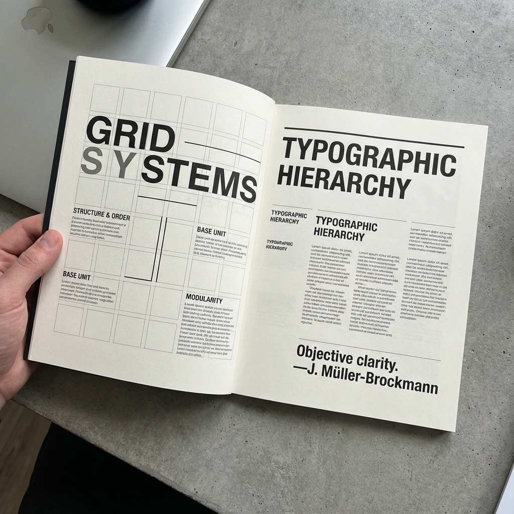
HELVETICA: THE ICONIC TYPEFACE
A deep dive into the history and influence of Helvetica, the quintessential Swiss typeface that has defined modern typography and visual communication.
April 15, 2025Read More →
Sans-serif typography evolved from industrial utility into a core tool for modern identity systems.
Its flexibility across print and screen made it central to Swiss design methods.
Current digital platforms continue this trajectory through variable fonts and responsive type scales.
A deep dive into the history and influence of Helvetica, the quintessential Swiss typeface that has defined modern typography and visual communication.
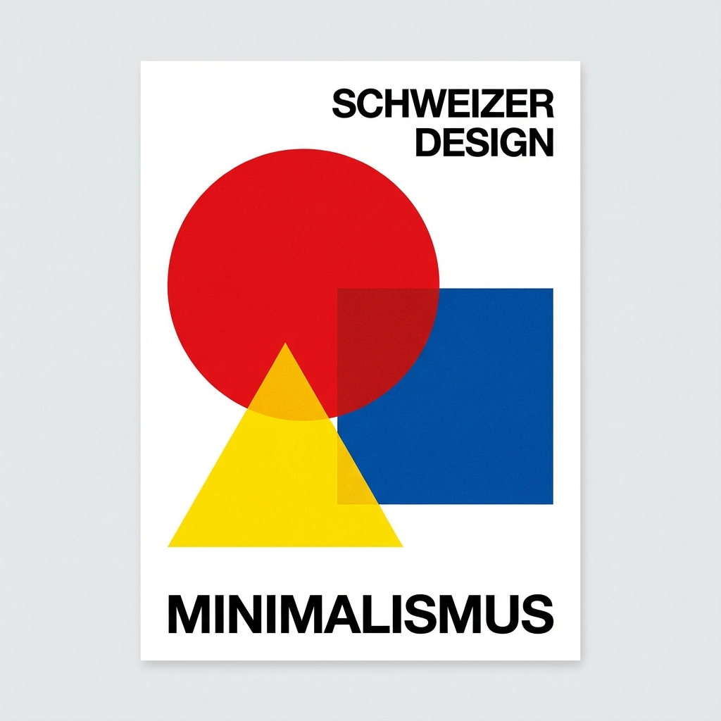
Understanding how Swiss designers establish clear typographic hierarchies to guide readers through content with precision and clarity.
Stay updated with our latest projects, insights, and events. We send our newsletter once a month.