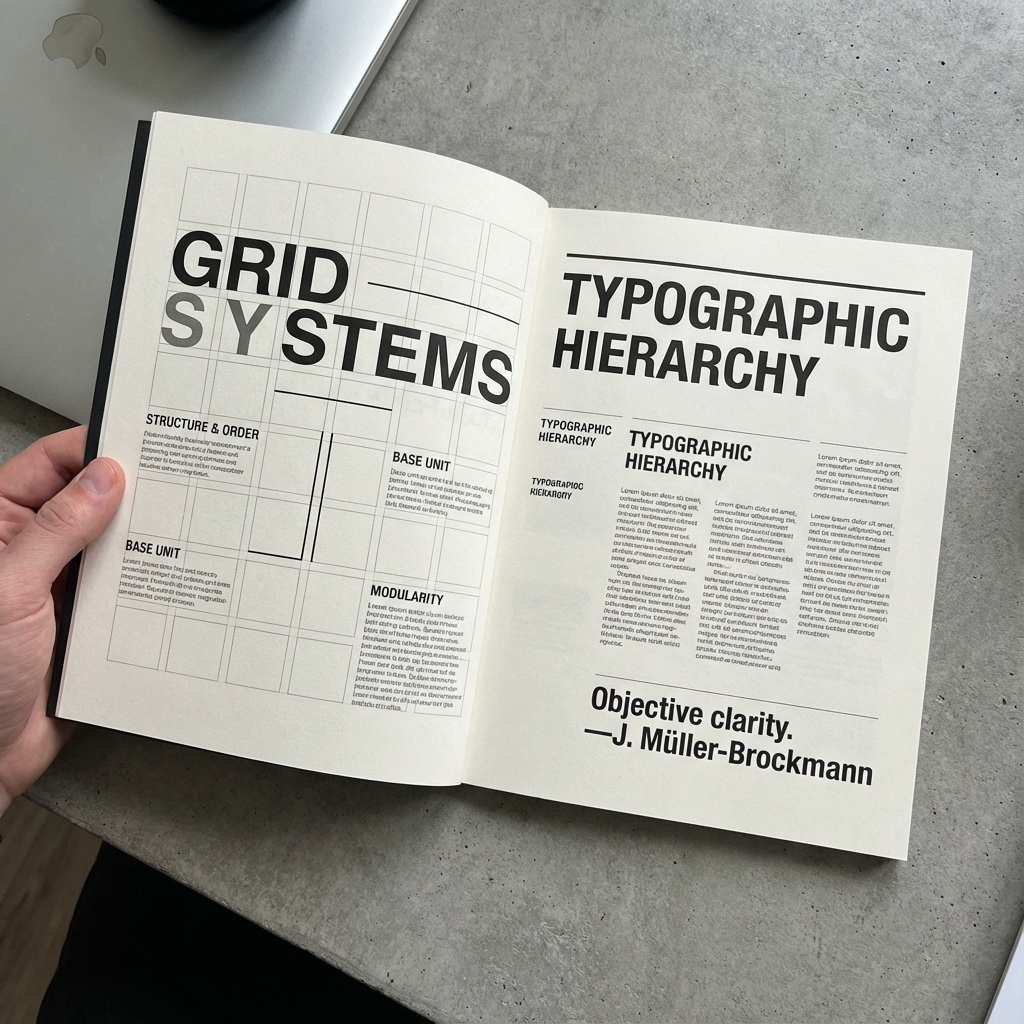
THE EVOLUTION OF SANS-SERIF TYPOGRAPHY
Exploring the development of sans-serif typography from its early days to its prominence in Swiss Design and modern digital interfaces.
February 15, 2025Read More →
Helvetica became iconic because it balances neutrality with legibility across many contexts.
Its success in signage, editorial, and interfaces demonstrates how type can carry both function and identity.
Modern teams still rely on these qualities when building scalable visual languages.
Exploring the development of sans-serif typography from its early days to its prominence in Swiss Design and modern digital interfaces.
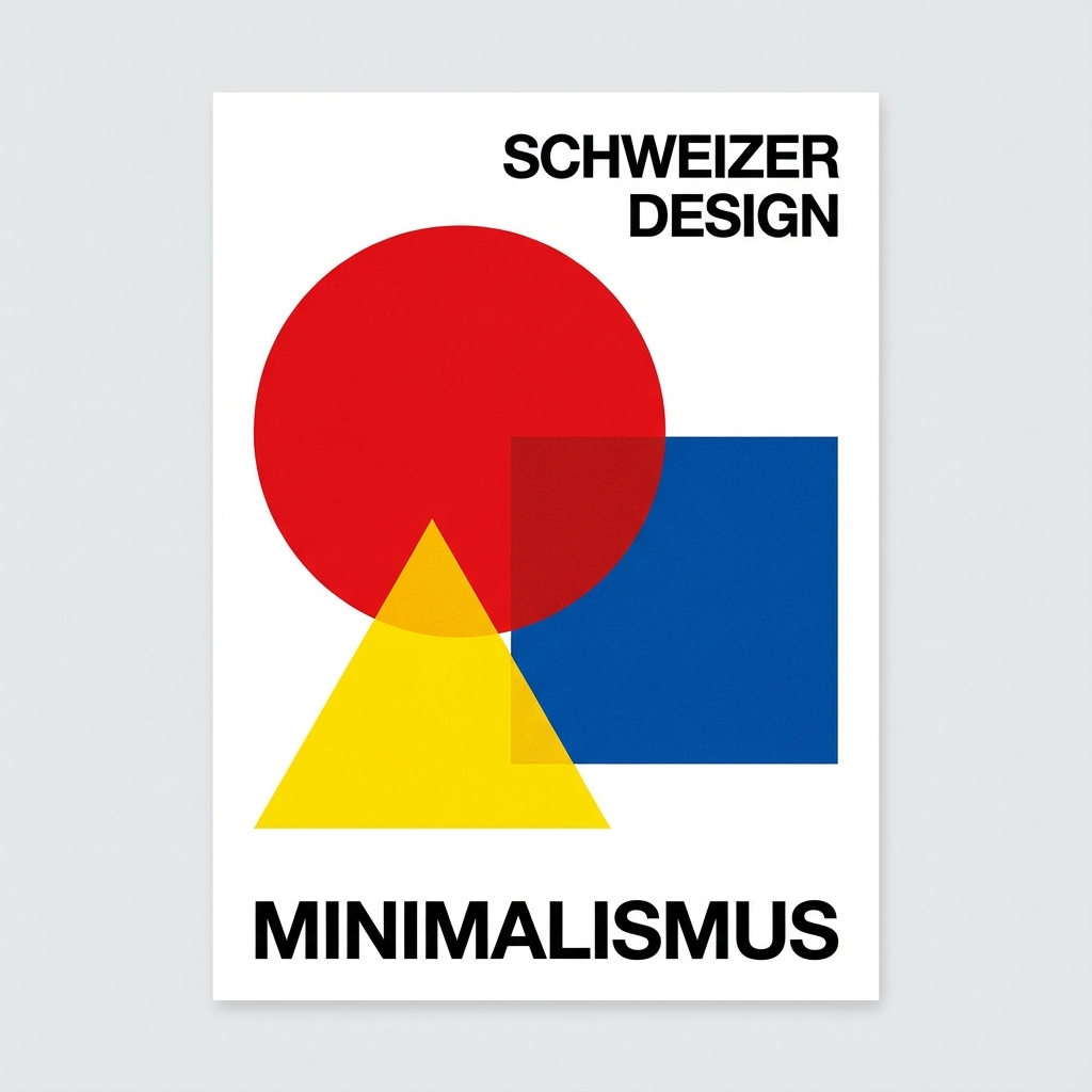
Understanding how Swiss designers establish clear typographic hierarchies to guide readers through content with precision and clarity.
Stay updated with our latest projects, insights, and events. We send our newsletter once a month.